My Role
Solo UX Designer
Teammates
Project Manager Developer CEO (Product Owner)
Tools
Adobe XD InVision Sketch Figma
Time & Deliverables
Jun 2020 - Sep 2020
Released in App Store

Solo UX Designer
Project Manager Developer CEO (Product Owner)
Adobe XD InVision Sketch Figma
Jun 2020 - Sep 2020
Released in App Store
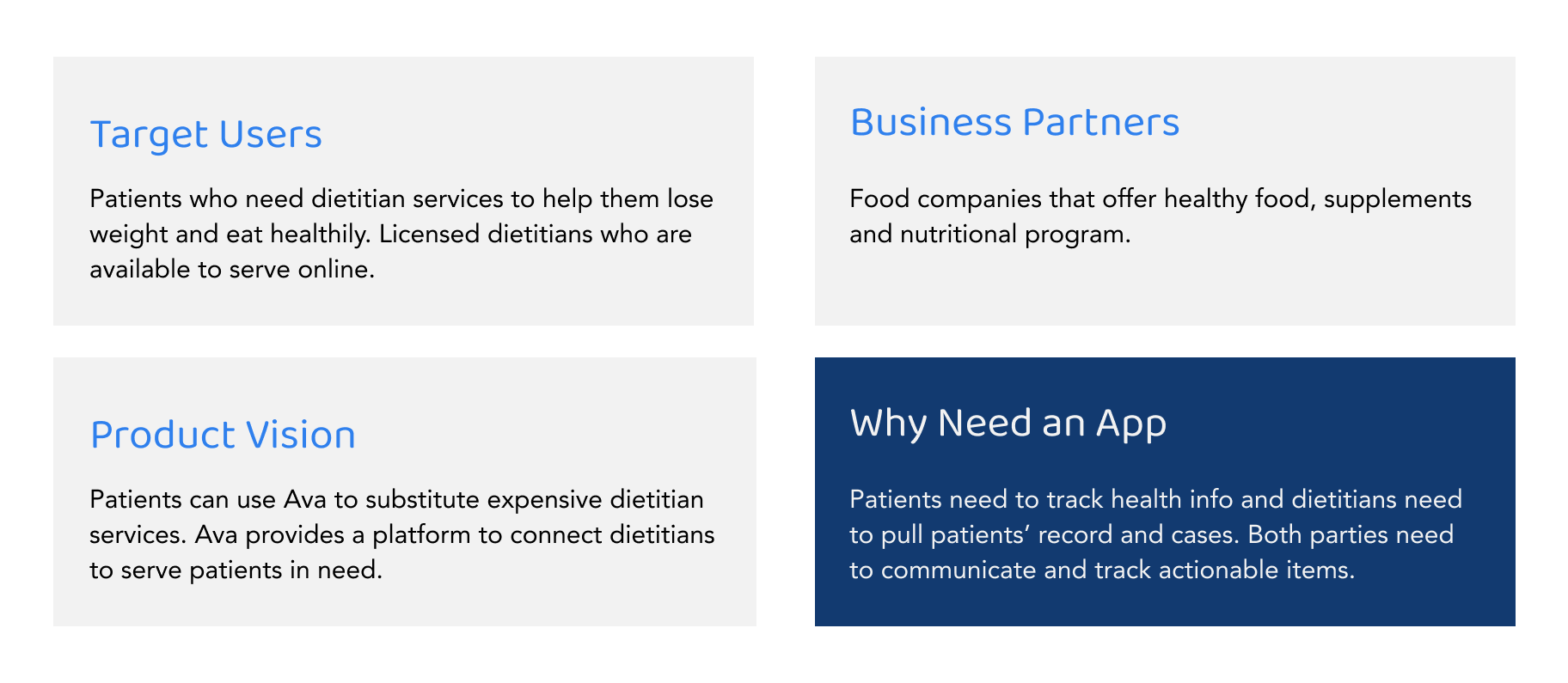
Ava is a health tech company whose application offers nutrition and coaching recommendations for weight loss and chronic conditions related to diet. It follows a B2B2C model. Ava builds and sells the app and its services to business partners such as food/supplements companies who sell healthy foods and want to offer health program. The apps features stay relatively the same but with partner's branding.
Ava has developed for 4 years and it has a relatively clear product vision - a platform that can substitute expensive dietitian services. It should be the Uber for dietitians and patients. We offer a platform for patients and dietitians. Patients ask for help, and available dietitians come to take the request. Dietitians can see patients' previous record and coach patients to have a balanced life. To do so, Ava's app has 3 main features - track nutrition and activity status, meal plan and logging, dietitian coaching services.

When I was first onboard, I had discussions with PM to understand the business model and product vision. We came to the agreement below as the foundation of any design challenges.
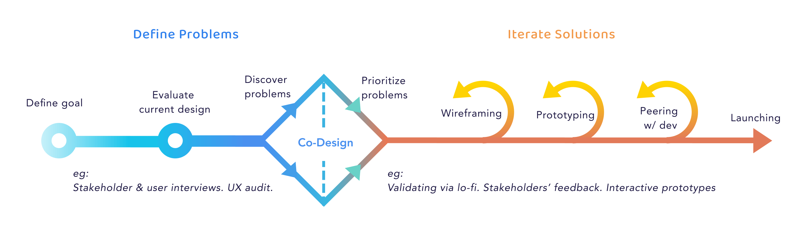
Since Ava is a fast-paced startup, we have a lean design process where PM gets business needs and quickly iterates with designers and developers. Based on feasibility and product strategy, we decide when & how to launch each feature.
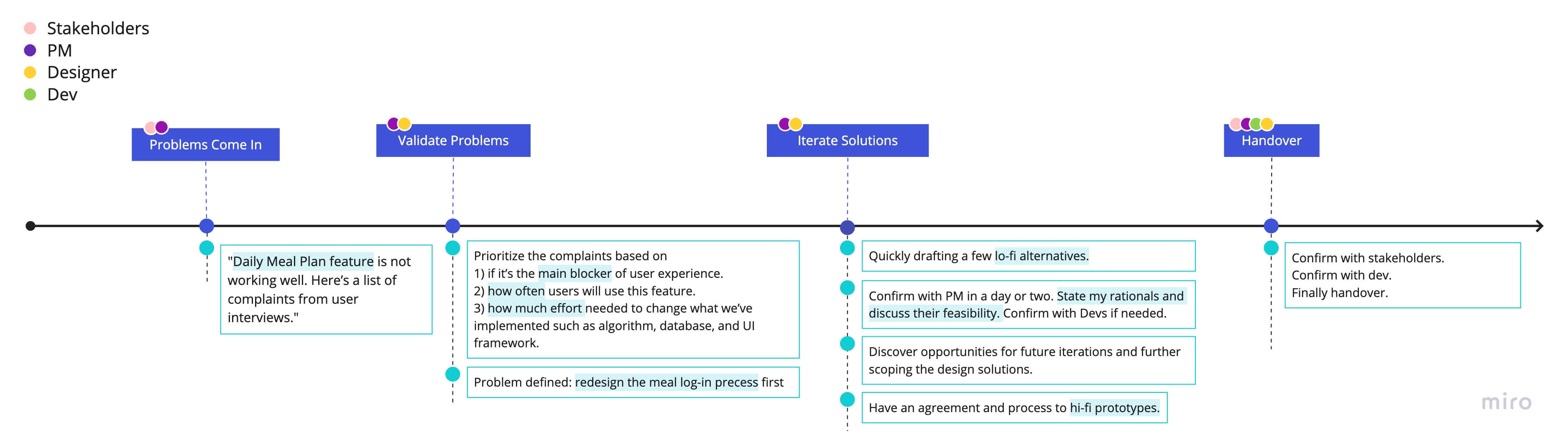
At Ava, PM is the person I work most closely with. She gets the requirement from stakeholders, and then she'll talk with me to scope the design challenge. After defining the core problems and confirming the constraints, I shall draw a few alternatives and discuss with PM again with my assumptions, questions and recommendations.
Here's an example of our end-to-end process when designing one of the features - meal-logging.
Ava has both digital products - a web platform for dititian coaches, and a mobile app for patients. During my 3 months at Ava, my work dabbled into differnt features on the mobile app for patients. The app was initially designed by a design agency a long time ago. While business partners are interested in Ava's business model, they are not satisfied with the app product. It's hard to use, outdated, and contains bad pratices in terms of its UI and interaction patterns. My work is to understand business requests and user pain points. Togather with PM, we defined and prioritized problems based on their urgency and resources needed. I would then redesign or create from scratch.
For you to best understand my design rationales, I focus on illustrating the process of solving one problem that I spent most time on. If you are interested to see other features I worked on, please to view Other Features at the end.
To provide users a balanced view of health, we offer massive health information - overall wellness, immutation, nutrition, sleep, activity, water, daily actionable items, and many more. In our old design, we force users to explore all of them, which violates the UX Heuristic - User Control & Freedom - one might only interested in activity and doesn't care about sleep tracking at all. The challenge is how to structure the information architecture so that users can quickly dive into their vital health info, and also be aware that health is a balance between different categories. It's not just about calories.
Understand your overall health status, navigate between your interested categories and check action items.
Health never only focuses on how much calories you take. We want to educate users to reach a balance. But we don't want to overwhelm them with too much information. So we give users the control over which category they want to dive in but also recommend them action items given the overall status.
The average time of finishing checking interested information decreased by ~70%, based on 4 usability testings with our business partners. The change was approved and implemented.
This redesign triggered a discussion of Ava's product strategy. We don't want users to stay long on this page. It should be quick for them to get the information they need. We started to assume users only use the app for 1 min.

I first had 1:1 with PM to understand our product vision. I understood that overall, our goal was to communicate clear actionable items and track sufficient health information. I did a heuristic evaluation on the old design, summarized problems I found and brought back to PM to confirm.
1. There're overwhelming amount of information that forces users to navigate through. No prioritization.
2. Overlooked daily action items. Didn't highlight on what users can do given the data.
3. Information hierarchy is messy. Had repeated access to the same information.
4. UI and interaction patterns are problematic.
Removed the slide interation on health categories. Added health category captions. Tried a few different style for category button. Moved the frequently used tab to the thumb area. Changed to one tap to dive in the chosen category.
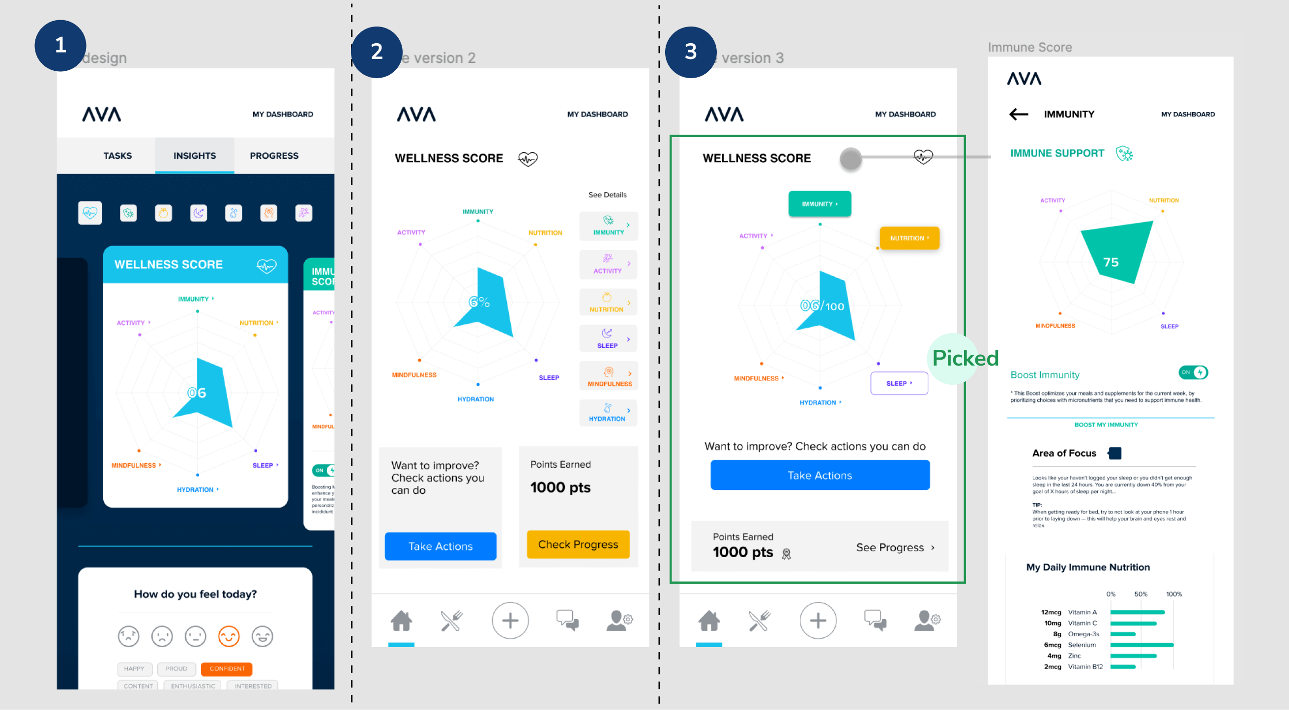
Another alternative in case Immunity has the same priority as Wellness. Unified content goes in each health category. No repetition.
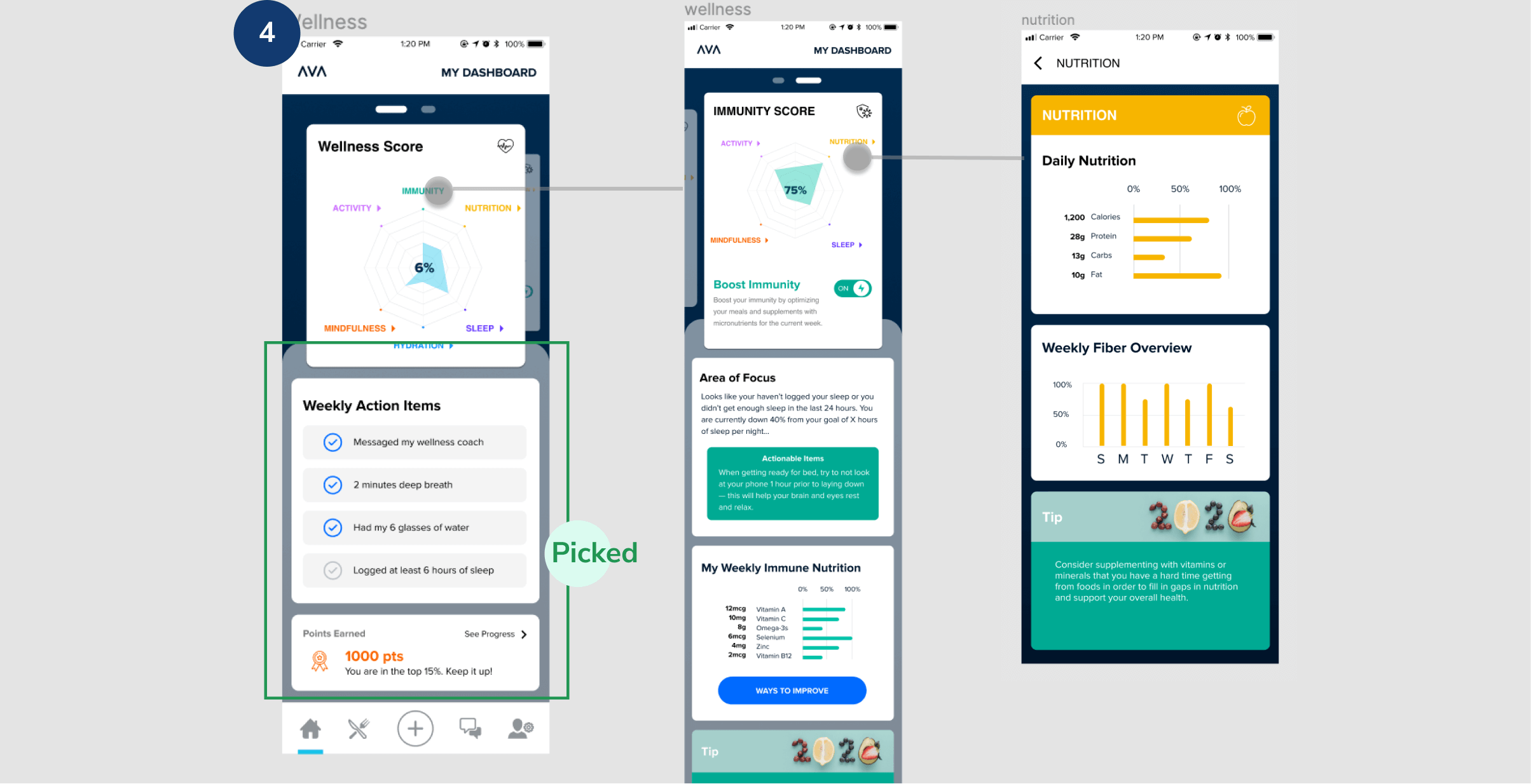
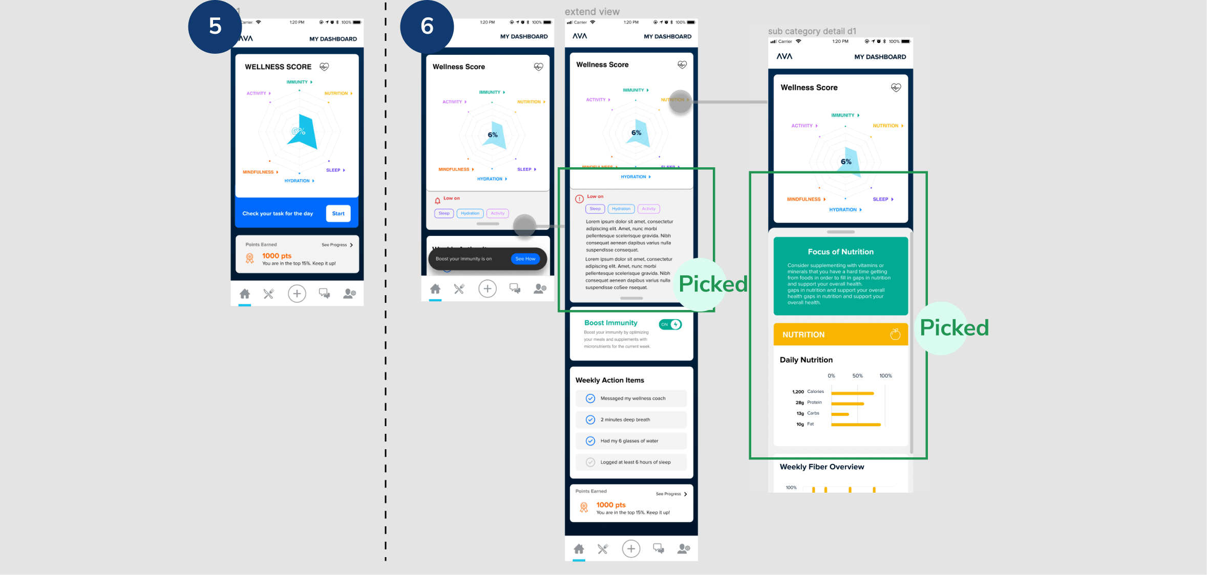
A few alternatives of briefing the dashboard and highlight task/actional items
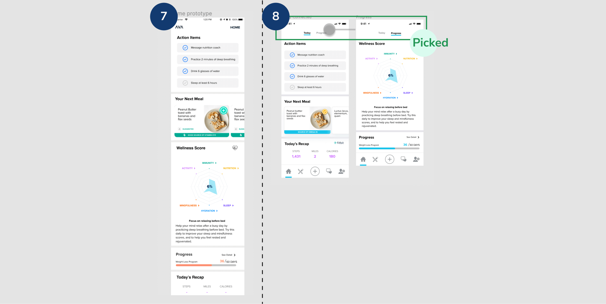
Further simplified diet suggestions. In the end, grouped content into 2 pages - today & progress. Shorter page. Faster navigation.
In roughly 2 weeks, given the backbone we had, we reached to a deliverable final design. We solved some of the problems identified earlier. We corrected interation design, cleaned the categories and reorganized the information hierarchy based on its priority. We emphasized actionable items to indicate what the data means to users.
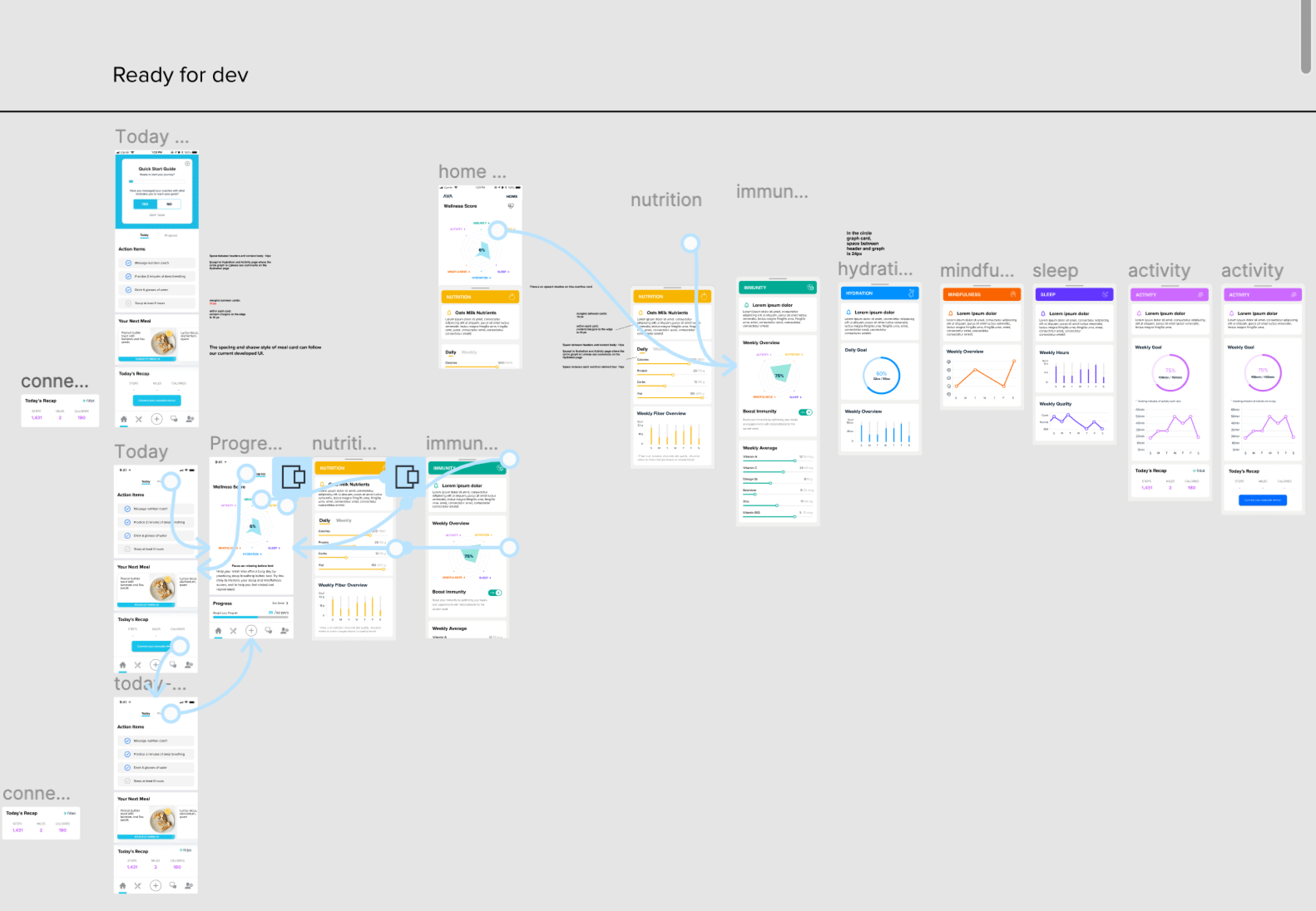
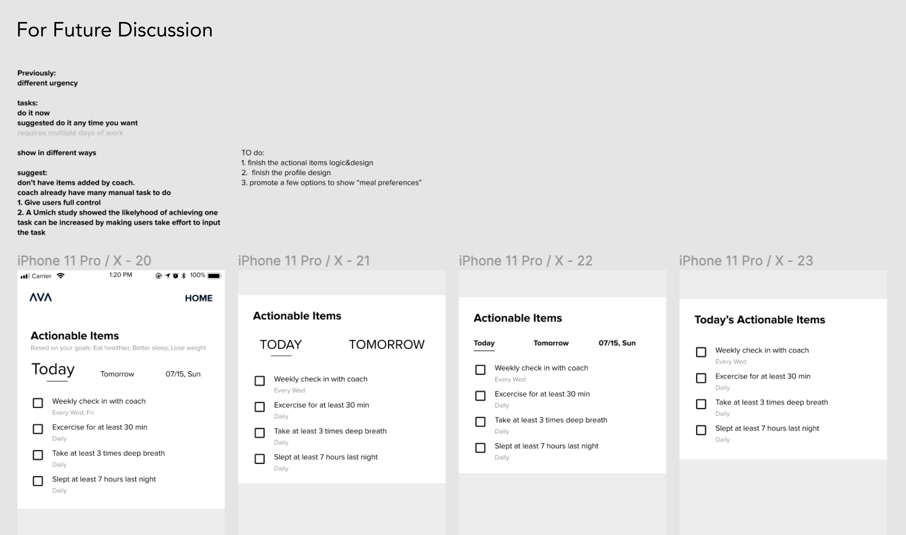
One remaining problem is on daily action items. The current design didn't give users a confirmation on where these items come from, and when I should finish them. We explored many possibilities that would be best benefits the users to act, but it required us to conduct new content. Because of the time limit, we decided to keep these ideas for future launch.
While working with PMs and other stakeholders, I led the team to think about what to present if users only use the app for 1 min. We went through the process of making trade-offs to collapse some information while highlighting the most important ones. The team realized that we should not force or expect users to go through all information. By restructuring the information architecture and using the right interaction pattern, we closed the gap between what we think is best for users and what users want to know.
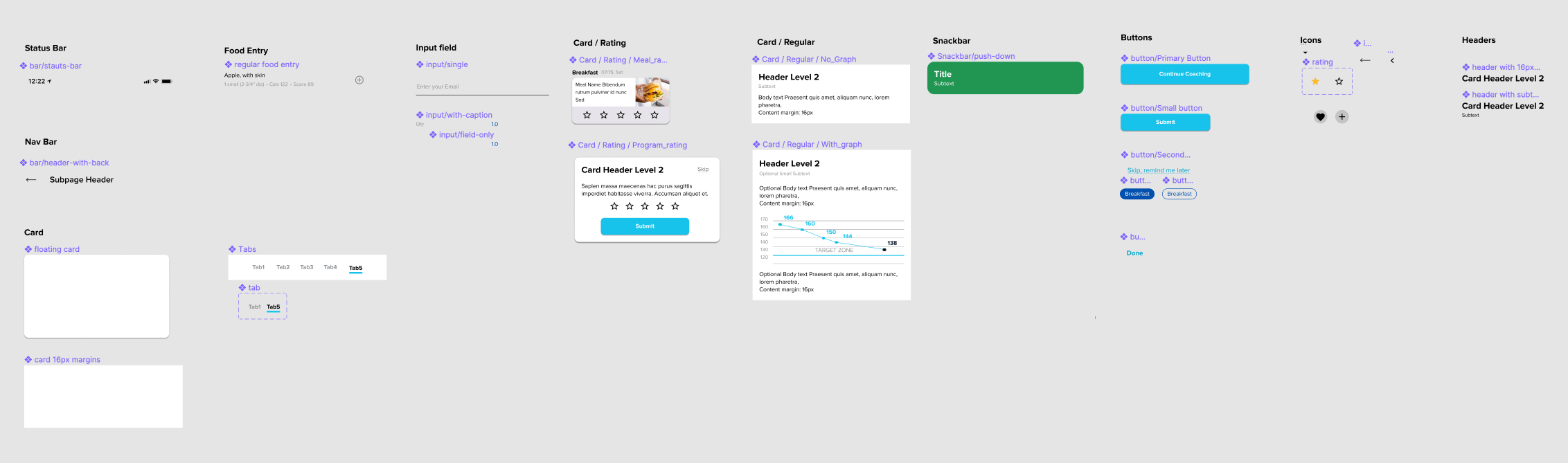
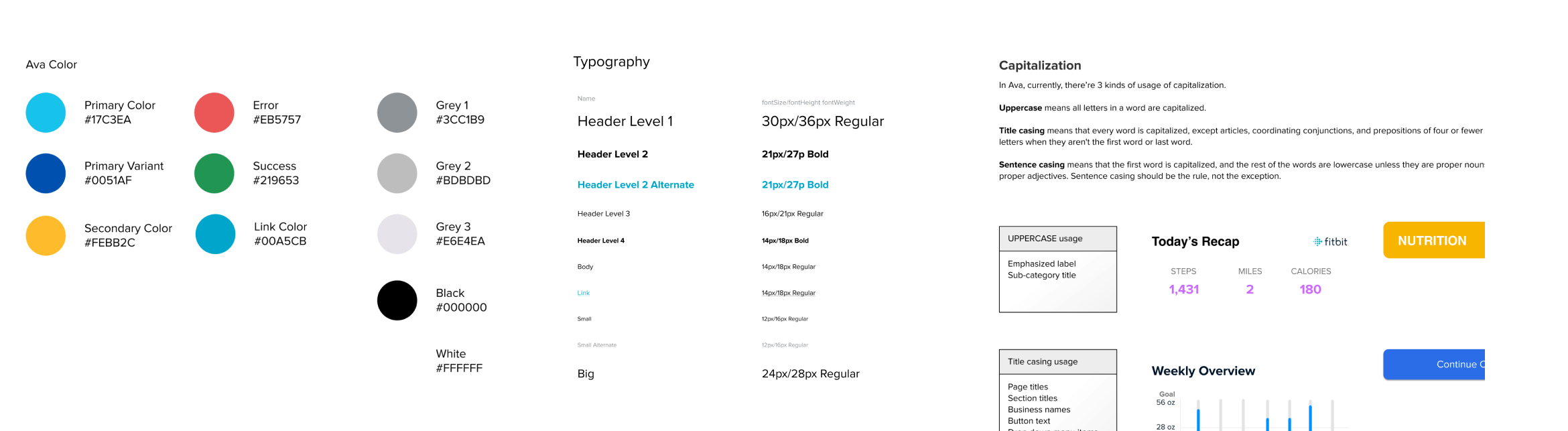
Since Ava's product was designed by several design agencies in response to different business partner's requests, the app is full of different design patterns. Features are launched in different phases and developers just grab whatever is handy. Therefore, after finishing a few urgent requests, I started defining an unified design pattern.
We want to enable users to record accurate nutrition intake. However, in our old design, meal-logging is everywhere - there're 3 places where users can log in meal, snack, or supplements, separately. In addition, during the logging process, users were confused of filling in food information. Quote from a user: "I can't even log in a banana. It's frustrating. "
This meal-logging problem relates to the old design of the Daily Mealplan feature, as user log in food from the Mealplan page. But it's very time-consuming to change the whole Daily Mealplan feature. Therefore, we decide to focus on changing the meal logging first, so that users can get their most fundamental task done - logging and tracking nutritions.
The most fundamental step - search and log-in each food item. Always a good entry point when you are not sure each category your food belongs be.
Users can quickly log-in meals, snacks, and supplements throughout the day. To minimize the number of clicks, we auto-select meal type based on the time of the food-logging event. For example, if users log-in before 11am, we auto select type Breakfast. It's not the most ideal solution but given the current Daily Mealplan main page We want to give them the flexibility to choose accurate items, units and quantity, but also not to overwhelm them with too many options.
Dine-in outside? No worries. Search the restaurant and find the items on your menu.
The team has build algorithms to catch restaurant menus and their dishes' nutrition. Users can search or find restaurants on our build-in map. We will provide its menu from where users can log their consumed dishes.
The success rate of logging meals, snacks and supplements was improved from 0 to 100%, based on 4 usability testings with our business partners. The change was approved and implemented.
Our business partners wants to gather customers reviews of their products. Our goal is to encourage users to rate meals they ate.
Rate previous meals you ate fast and easy.
The meal rating is available on the next day. You can skip it and meals you didn't rate will accumulate until the 3rd day. An unrated meal-card will only appear when you first open the app on the day. For each rating card, you can see the date and type of the meal, to remind you when you ate it so that you can give an accurate rating.
The feature was approved by our business partners and implemented. We didn't get a chance to do usability testing. But if there's more resource, the success metric I'll be looking at is the number of clicks on the "Submit" vs. the number of clicks on "Skip".
One of our main service is messaging dietitians. We offer 14 days free trials. Our goal is to encourage users try out coaching services during the free trial and then smoothly switched to paid subscription.
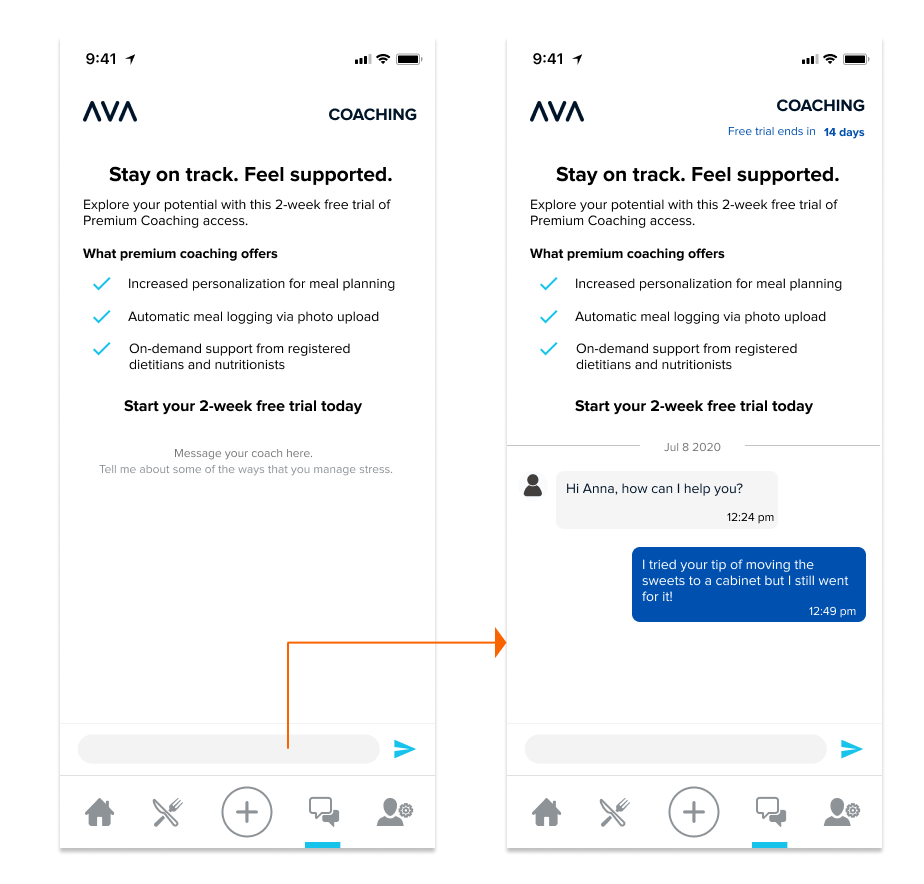
Start 14 days of free trial by messaging coaches.
Start subscription after free trial ended.
Users are still able to view previous conversations during free trials to remind them how good coach service is
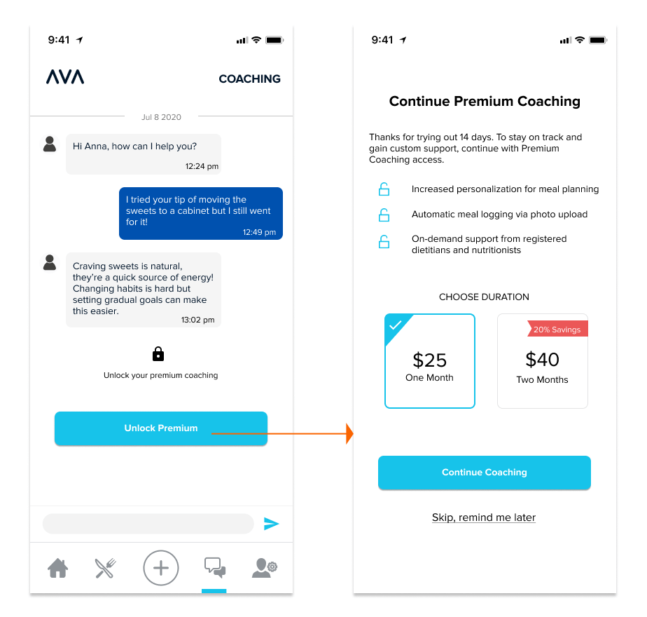
The feature was approved by our business partners and implemented. We didn't get a chance to do usability testing. But if there's more resource, the success metric I'll be looking at is the conversion rate of paid premium, before and after the free trial ends.
I was aware of the speed we were moving and the limited resources we had, but I want to open up to design opportunities that can deliver the best user experience and bring the most profit. Therefore, I always brought several design alternatives to the table - the ideal version and the quick & nasty approaches, to discuss with devs and PM. In such a case, the team was able to find a middle ground or launch the ideal design into phases.
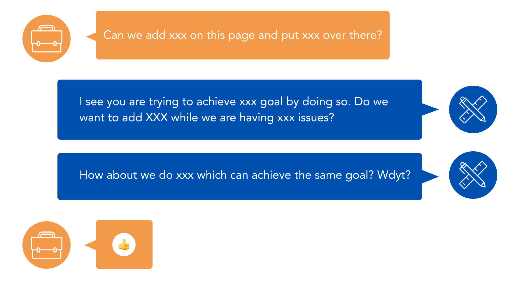
Since Ava is moving fast, the business request sometimes could come spontaneously and direct a designer with a certain solution in mind. It's my responsibility to take the request, think if it's a valid problem and approach, and either finalize the solution or push back the request. It's a subtle art of communicating your disagreement. I like to discuss in a way of we are on the same side. I'm not opposing you. I'm trying to discuss if there's a better way of achieving the same goal. Adding a "wdyt?" often opens the discussion.
Please feel free to reach out to me at
valxwz@umich.edu
for more details. Thanks!