Product
dtcpay mobile app
Worked with
Product Manager Engineers Marketing
Scope of work
Campaign launch alignment Problem definition UI/UX design
Design Timeline
Apr 2025 (~2 weeks)
Case Overview
Context
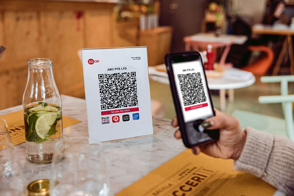
The business identified an untapped need for offline stablecoin payments and aims to enter early to capture market share. To reach the mass market, we’re enabling more offline payment scenarios using foreign currencies and stablecoins. We joined the NETS SG60 campaign, offering incentives to attract new Web3 users naturally aligned to our services —especially to try out Scan SGQR and Pay.
Solution at a Glance
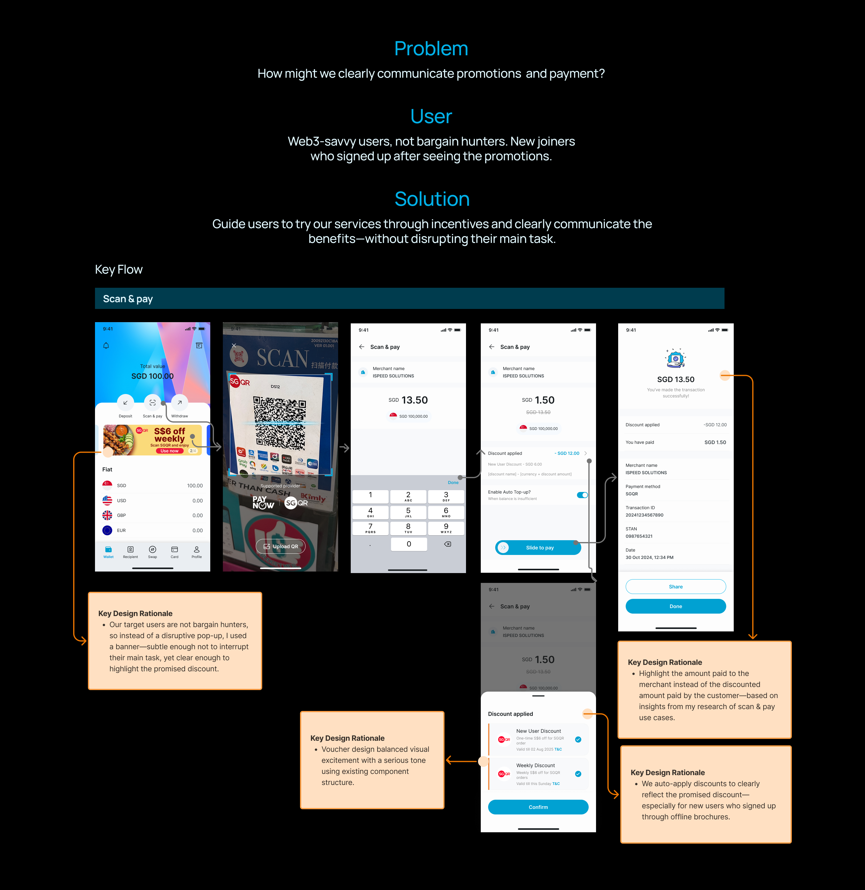
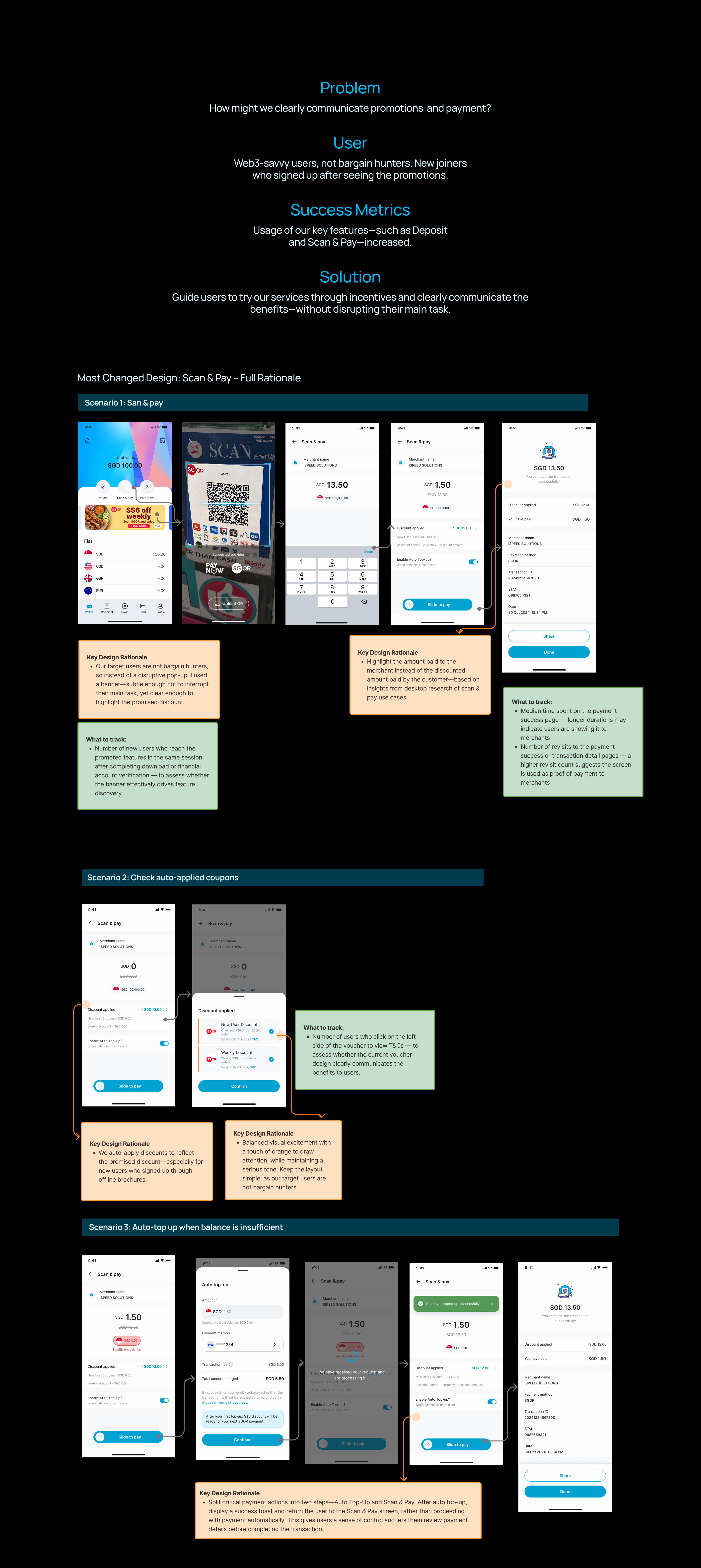
We collaborated closely with the marketing team to align on project goals, ensure offline campaign discovery, and connect it seamlessly with the online experience. You can explore the full process in the Design Process—below is a quick look at the final online solution.
Design Process
Initially, I saw conflicting goals…
Based on my research, customers come to us for our unique stablecoin payment services, which they can’t find elsewhere. Our core users were web 3, high-net-worth individuals transacting with stablecoins. But the campaign aimed for mass exposure via NETS SGQR. Are we looking to broaden adoption to the Web2 general public and integrate into their daily payment habits? Why & how? Because of unclear goals and target audience, I needed to align cross-functional teams and design a seamless end-to-end experience—from discovery at merchants to app download, usage, and long-term engagement.
Target user?
Web 2 mass market, or Web3-savvy crowd?
End goal?
Increase adoption on existing features, or expand our roadmap to other use cases?
Promotion?
Where do you want to draw attention? What features do we want people to use?
Alignment
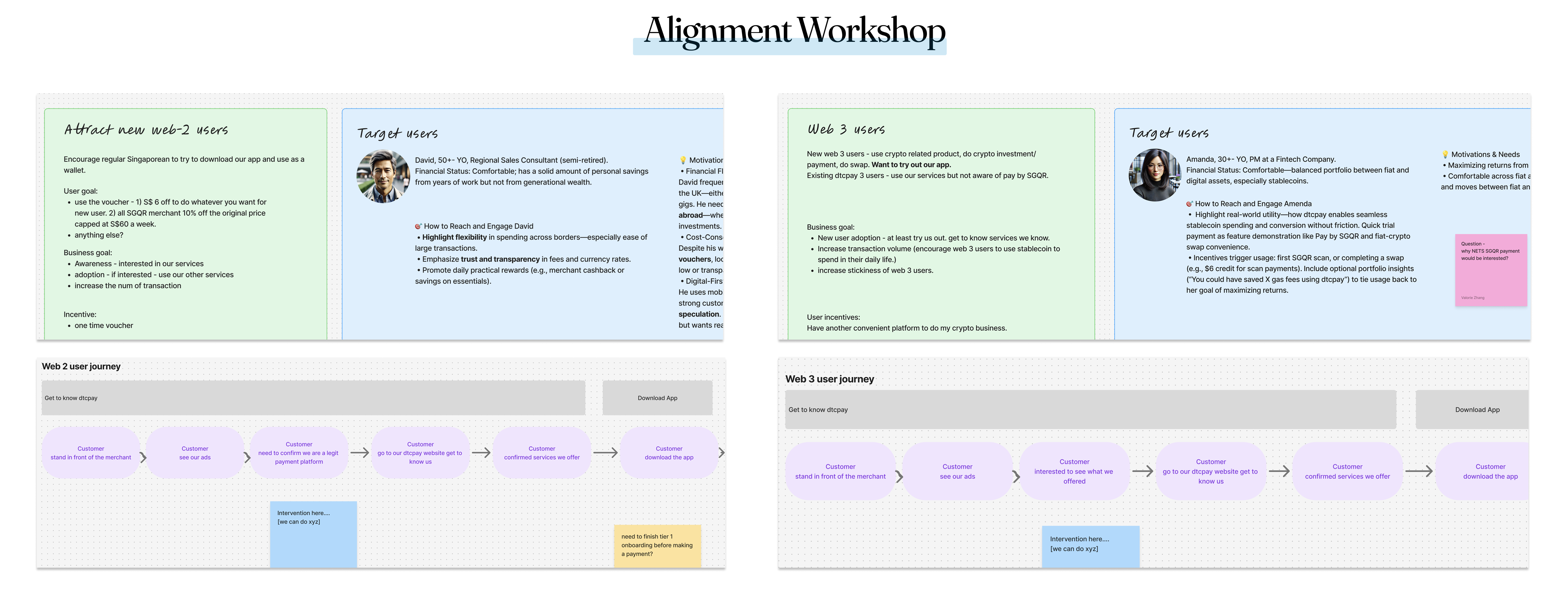
The project context was unclear, and I heard differing opinions from stakeholders. In addition, there was no service blueprint. So I mapped out potential user personas and their journeys to explore how we could onboard them from offline to online. With this, I hosted a one-hour workshop with the product team to align on why we build it and what to build.
Think Beyond the Screen
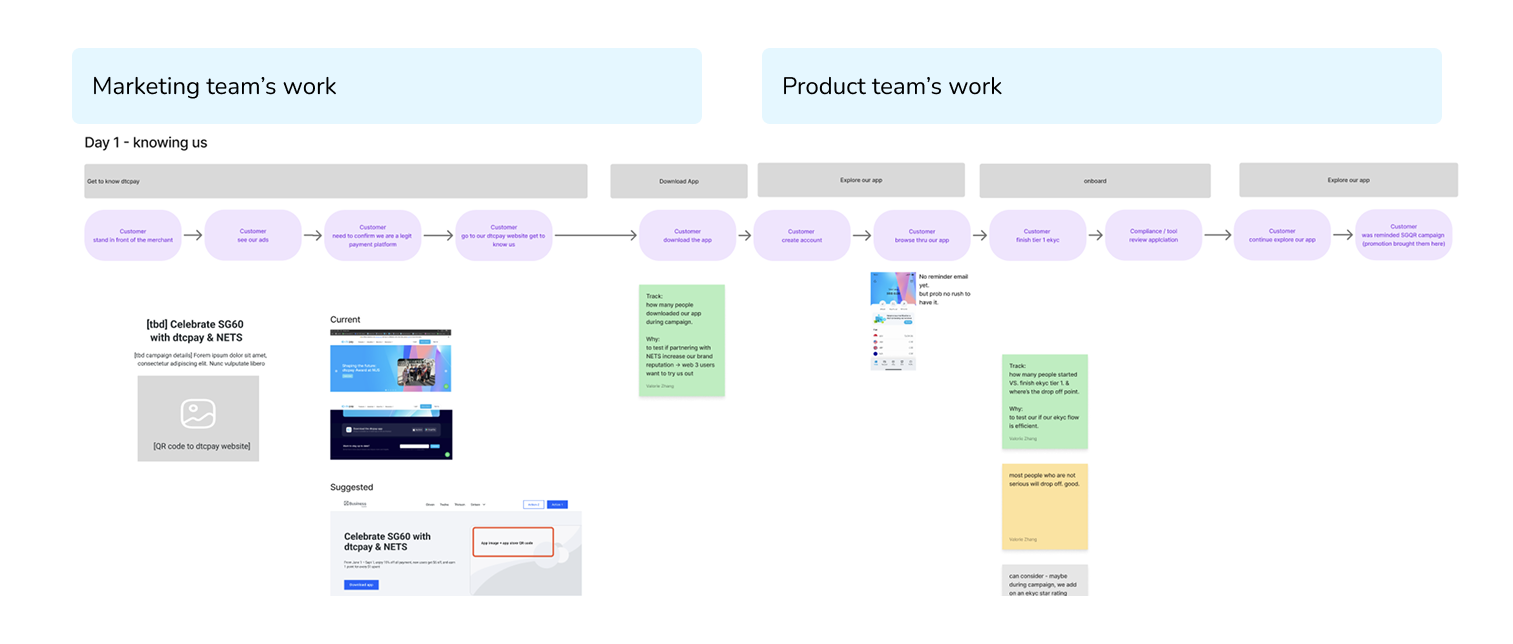
I zoomed out to consider the full user funnel—from offline discovery to in-app engagement—and aligned with marketing on key touch points. Based on my research showing users came to us for our unique payment services, I proposed guiding users to our website first to build trust and showcase our services. Marketing agreed, and from there, we direct users to download the app, creating a more intentional and informed onboarding flow.
Question Answered
Target user
Web3 enthusiast - would join for our unique services.
End goal
Increase adoption of existing features. Attract new users naturally aligned with our services—Scan & Pay, boost transaction volume, and raise card sign-up rates.
Promotion
Give vouchers to encourage new users to try key features—Scan & Pay, Deposit, and Card usage.
Solution Details
Final Design
To view all iterations, success metrics, pixel-level work, design rationales, and tracking points, please refer to the Figma file. The design is scheduled to launch, so impact data isn’t available yet—but the key metrics to track have been documented.
To see my launched work and its impact, check out my Ninja Van project.
Design Iterations
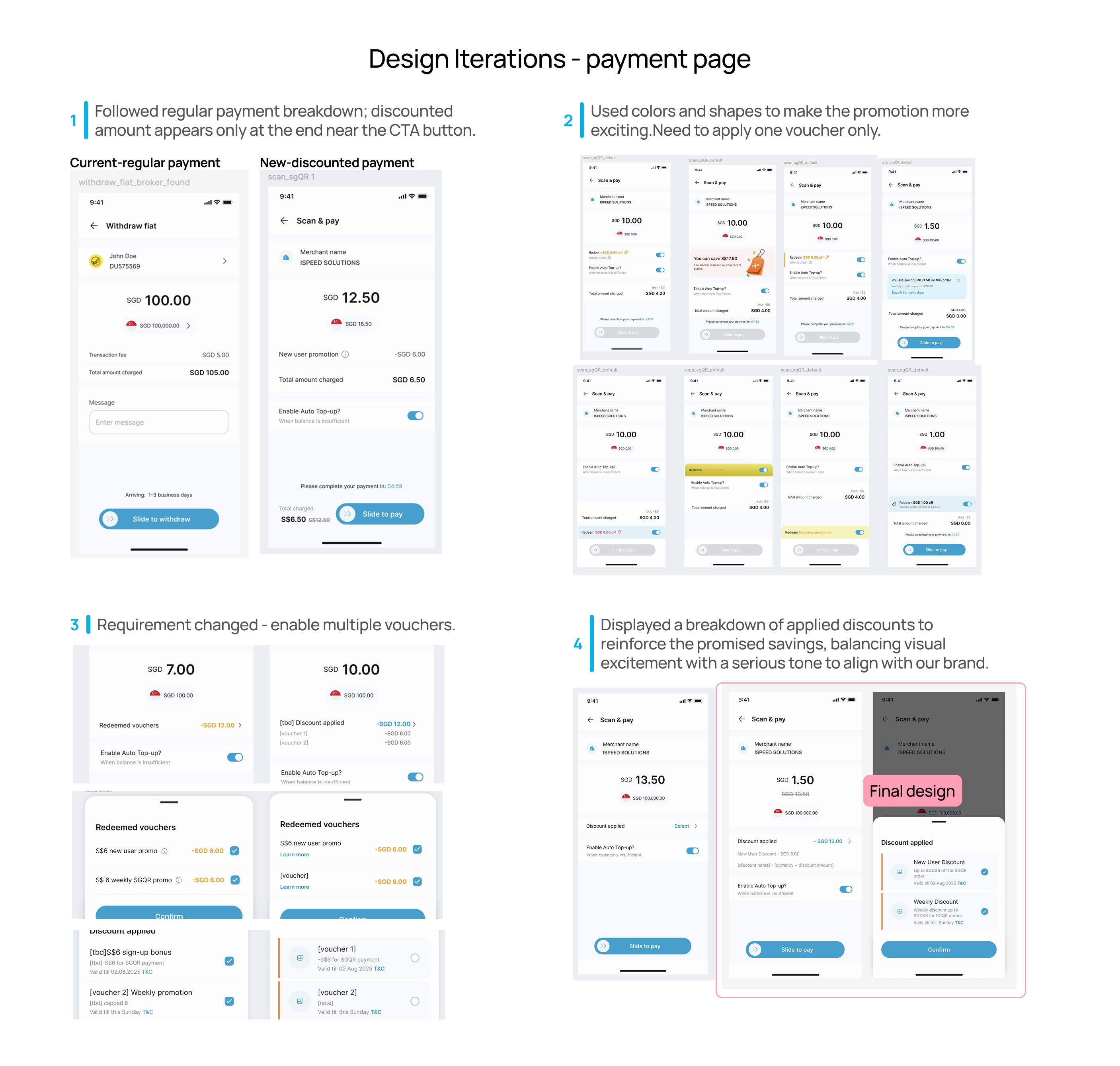
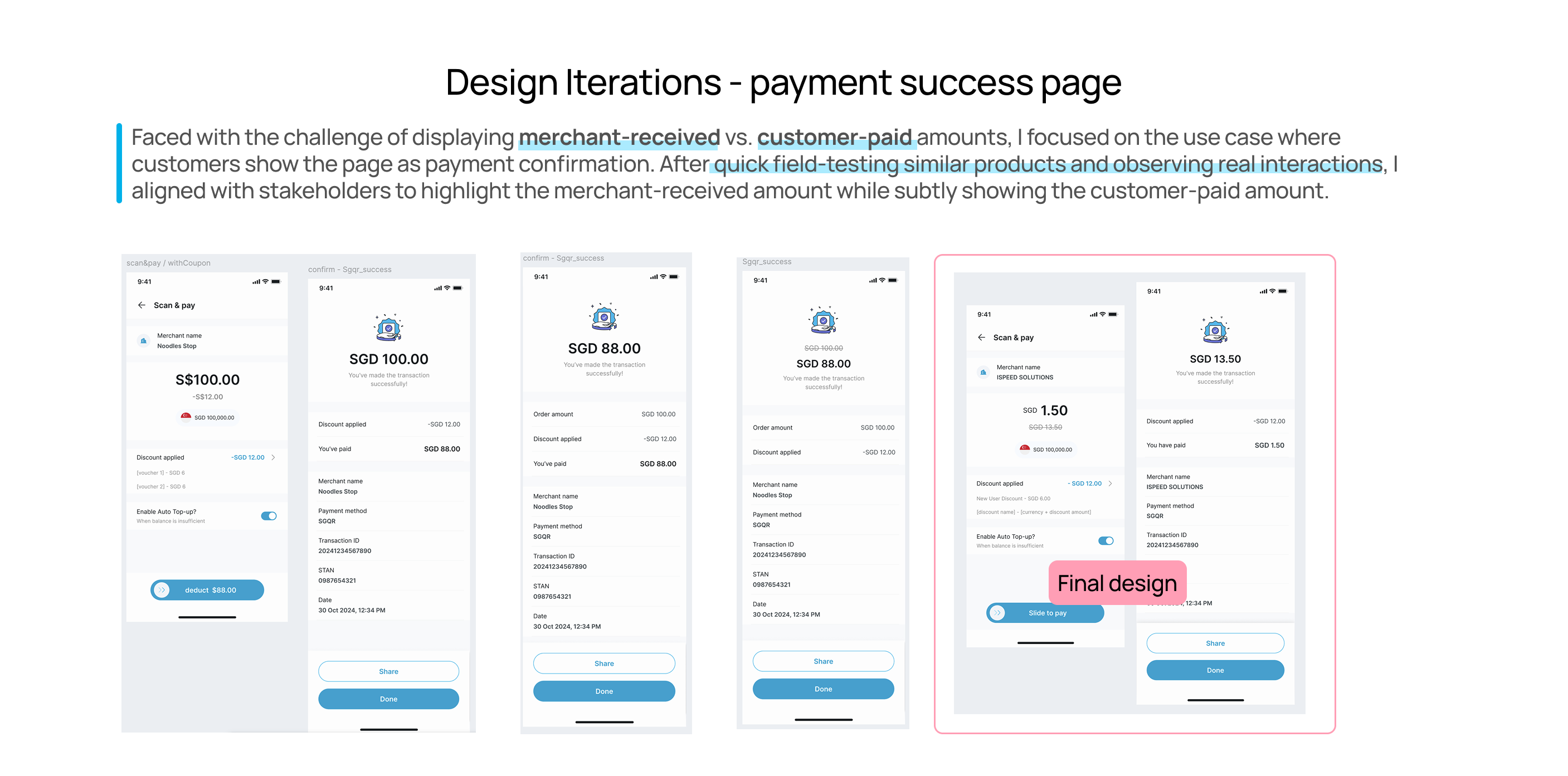
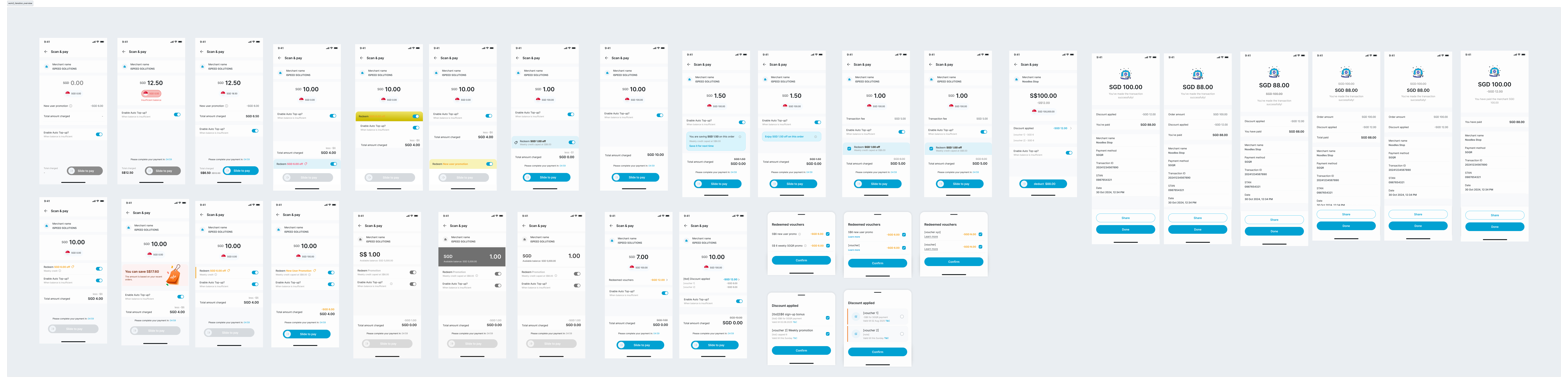
Most of the iteration discussions focused on the payment page and payment success page. Below is a summary of key design changes. For a full view of the alternatives I explored and the thinking behind them, feel free to reach out!
Future Consideration
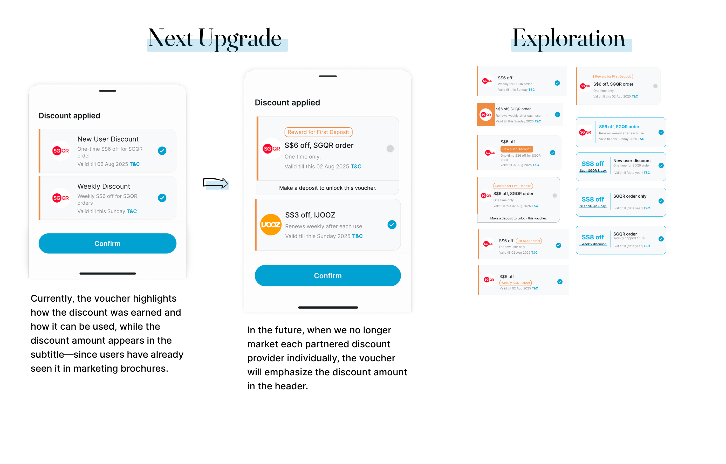
The current voucher design prioritizes minimal implementation by reusing our existing list component, focusing more on partner visibility than the actual discount amount. However, it doesn’t account for more complex voucher rules or highlight key details like discount value or usage frequency. As we introduce varied discount types, a new design will be needed. I’ve explored future design directions here. Curious about my design rationale? Let’s chat!
Lesson Learned
Want to know what I learned from this work? Talk to me! I don't bite :)